Page 3 of 6
Posted: Wed Jul 21, 2010 9:24 pm
by caribe
BTW, I think the Fixe image is warm, simple and iconic. The Sobe symbol is aggressive and excessively complex.
Posted: Wed Jul 21, 2010 10:02 pm
by pigsteak
vanderwaals goo, caribe!
the webbing between the thumb is wierd in Option 1....
3 for me.
btw Uber...don't you like the critical feedback...lol...thx for your time on this.
Posted: Wed Jul 21, 2010 10:05 pm
by Meadows
The Fixe has to be simple - it's printed on metal. This is an image for the site, not gear. The skink just doesn't seem like a Kentucky climbing icon, IMO.
Posted: Wed Jul 21, 2010 10:28 pm
by 512OW
I think simpler, easier to recognize at a glance is better...
Posted: Wed Jul 21, 2010 10:49 pm
by caribe
Meadows wrote:The Fixe has to be simple - it's printed on metal. This is an image for the site, not gear. The skink just doesn't seem like a Kentucky climbing icon, IMO.
Its simple even when its not printed on metal.
http://www.fixeclimbing.com/
Posted: Wed Jul 21, 2010 10:59 pm
by ynot
lizards rule
Posted: Wed Jul 21, 2010 11:04 pm
by caribe
512OW wrote:I think simpler, easier to recognize at a glance is better...
Agreed. Yeah, don't get me wrong, the skink was just a suggestion. Something more minimalist and more iconic than what you got right now is desirable.
Posted: Wed Jul 21, 2010 11:16 pm
by der uber
pigsteak wrote:btw Uber...don't you like the critical feedback...lol...thx for your time on this.
Uh, trying to comprehend. I got no time in on this aside from that initial post.
I like the simple, graphic logos usually. Apple, NBA, Quaker Oats, etc.
I like 3 better than the current, because it's just text and has a decent type/effect treatment. I don't think it's all that imprtant as long as it isn't really stupid, and the site is easy to use.
And I offered up css/jquery because I'm a c3 .net developer and I assume that the site is a refresh of the current framework. When it comes to css and jquery, on the other hand, I'm knowledgeable.
And if I did help I would expect nothing less than the most critical and constructive feedback by good-natured forum users just trying to make the site better.
Posted: Thu Jul 22, 2010 12:10 am
by Barnacle Ben
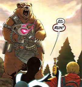
How can it not be a fucking bear? Preferably a cyborg bear.

Posted: Thu Jul 22, 2010 12:13 am
by Barnacle Ben
I just googled 'cyborg bear' and that is what came up.
